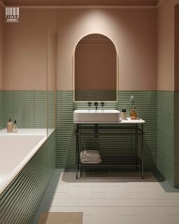
Shaping Spaces: The Artistry of Hot Rock Mosaic Tiles
In the intricate dance of design, every detail matters, and at the heart of creating a truly luxurious space lies the choice of materials. There’s a certain magic in spaces adorned with exquisit

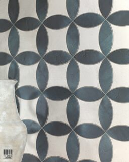
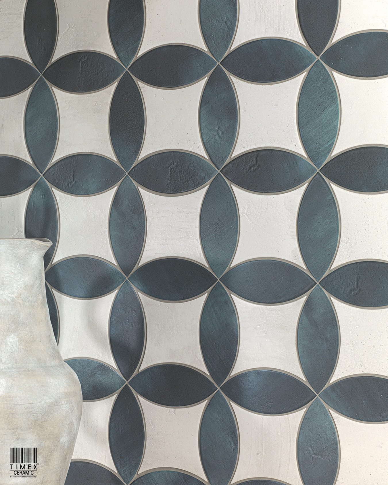
Small Tiles, Big Stories: Boutique Tiles
Embarking on a design journey often begins with a canvas, but what if that canvas could tell a story? Boutique tiles, with their small yet impactful presence, weave tales of sophistication and persona

Metro Tiles: A Guide to Incorporating the Latest Trend in Your Home Decor
Say goodbye to boring walls and hello to stunning style! Metro tiles are the ultimate solution for anyone looking to add a touch of timeless beauty to their home decor. With a variety of styles, color

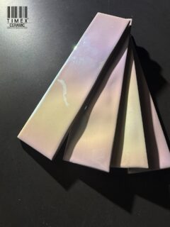
Glossy Tiles Vs Matte Tiles – Which One Is Better?
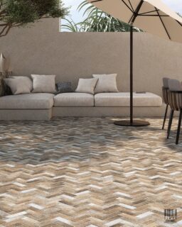
Happiness is found in the smallest things. With a new found value in interior design, small-format tiles are back in new shape, size & patterns and they’re here to stay. Timex Ceramic, ceramic t

Ceramic Wall Tiles – A Guide to Choose Tiles
Is decorating spaces on your mind? Decorative ceramic wall tiles are the answer. The tiles are available in pleasing and beautiful designs to suit individual choices. They are suited for decoration of
Follow Us
Like us on Instagram