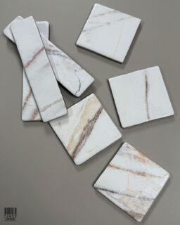
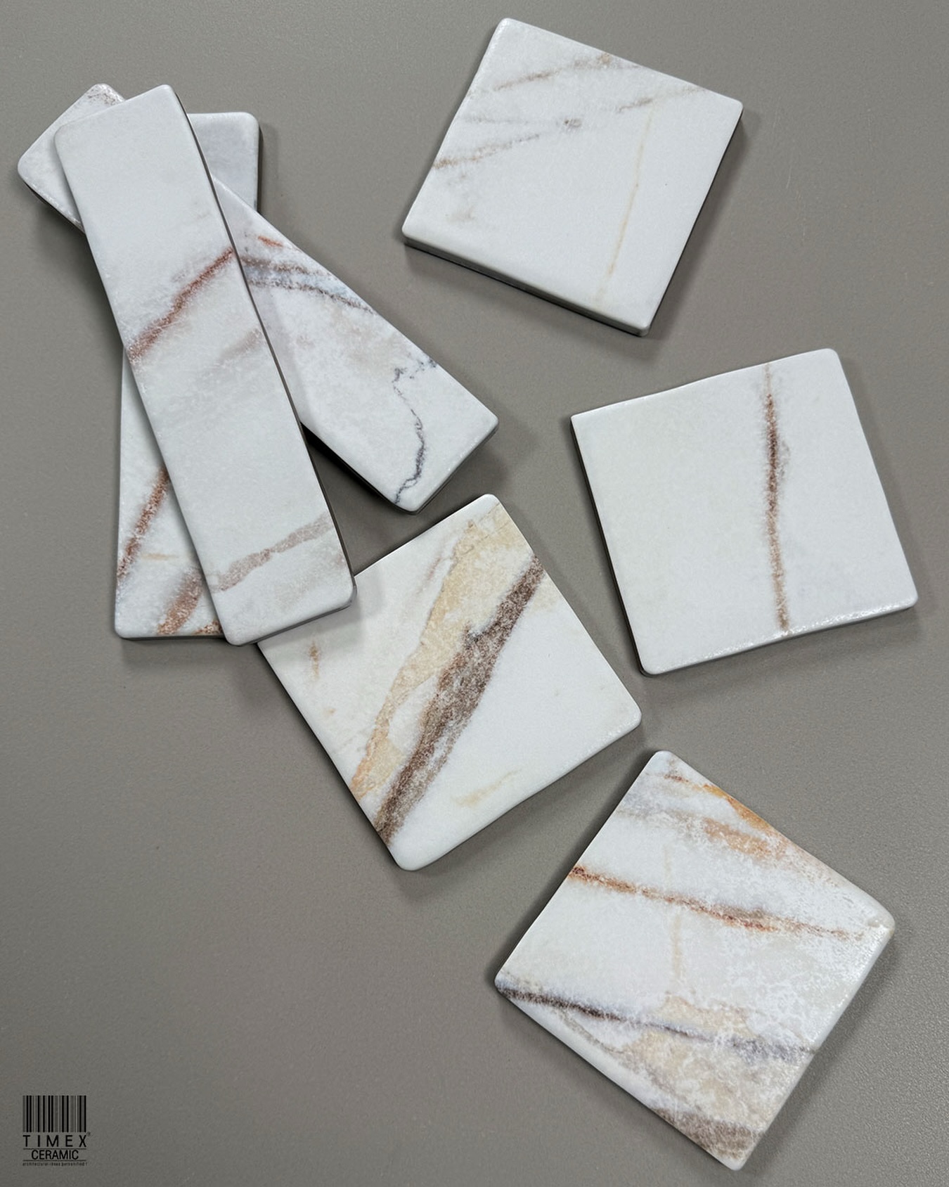
The Timeless Allure of Natural Stone with Modern Durability
Introducing the Crosscut Series by Timex Ceramic Few materials evoke emotion like natural stone. Its rugged beauty, weathered texture, and quiet opulence have adorned everything from ancient sanctuari

Subway Tiles – Multiple Sizes, Infinite Layout
Subway tiles are timeless. Originally designed for New York City subway stations in the early 1900s, they were prized for their clean lines and glossy finish. Over the years, these humble rectangles h
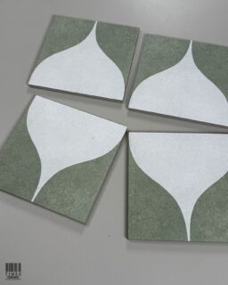
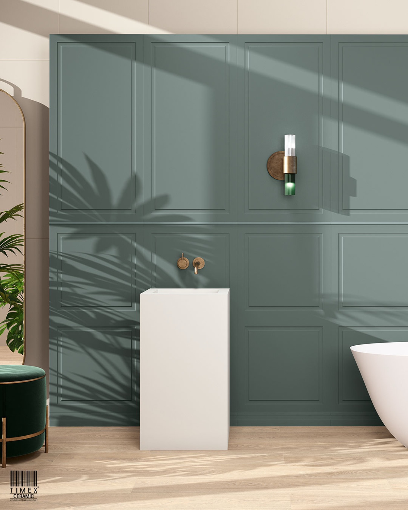
Echoes of the Outdoors in Every Step – Nature-Inspired Tiles for Serene Living
Introduction To Biophilic Design: Your home is more than just a place—it’s your sanctuary. In today’s high-paced lifestyle, creating a peaceful, grounding environment has become a necessity. One

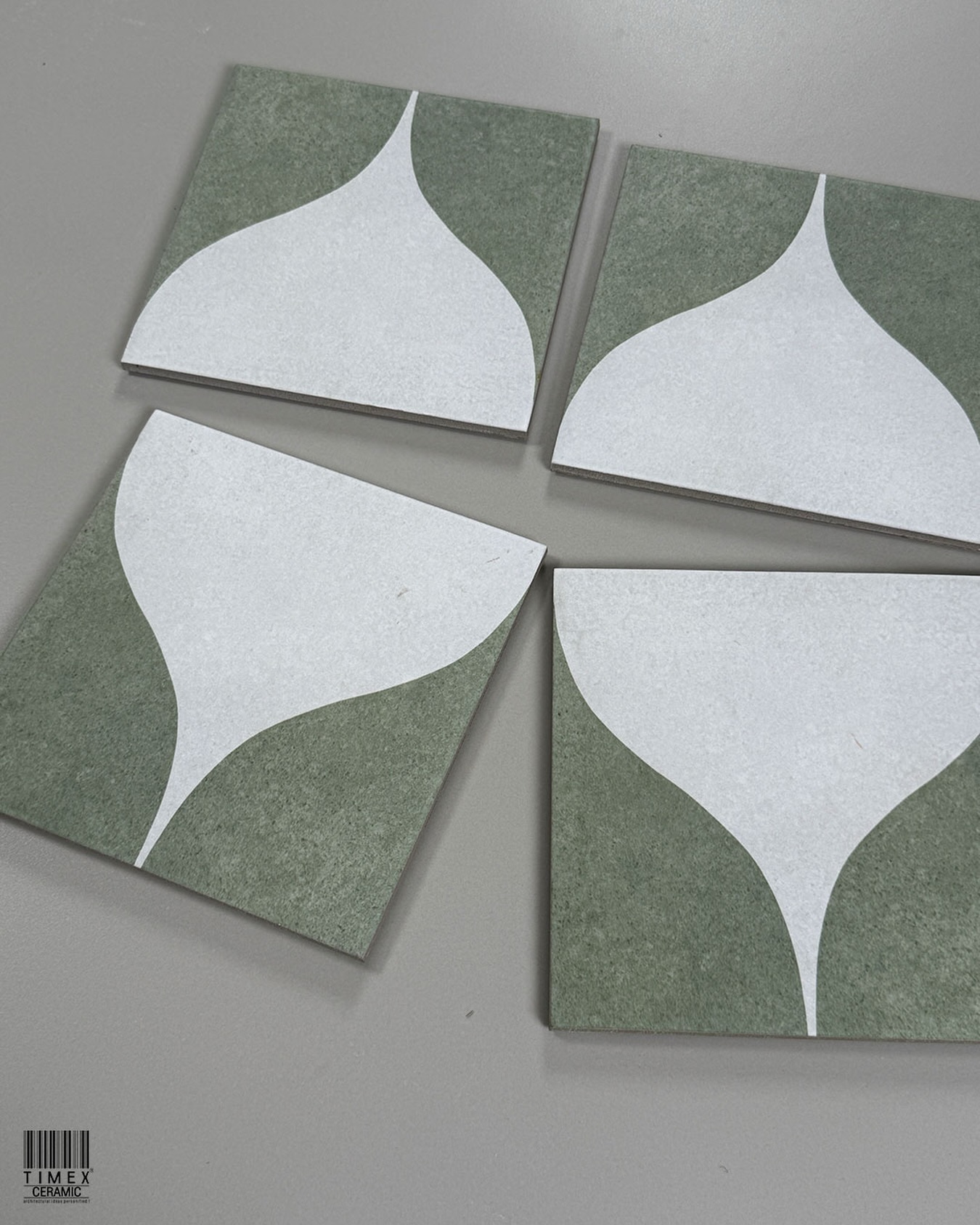
Top 2 Brick Tile Design Trends You Need to Know for 2025
Brick tiles are back in the spotlight for 2025 — and they’re more stylish, versatile, and low maintenance than ever. At Timex Ceramic, we bring you the best in brick wall tiles, brick tile designs

The Elegance of Large Format Tiles 2025 – A Game Changer in Modern Design
Large-format tiles have transformed modern interiors, offering a sleek and seamless aesthetic that enhances both residential and commercial spaces. With minimal grout lines, incredible versatility, an
Follow Us
Like us on Instagram