Follow Us

Facebook
YouTube
Pinterest
Instagram

Contact Us

Like us on Instagram

@timexceramic_
Timex Ceramic

@timexceramic_

Your global destination for premium ceramic tiles. Imported from Spain,Italy & China. #TimexCeramic #ImportedTiles #HomeDesign
  • One tile. Different spaces. A distinctly different character.

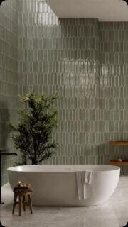
The Vestige Series is designed for interiors where the surface needs to bring colour, texture and visual depth without losing a sense of refinement. Its softly weathered green and off-white character gives the tile a natural, lived-in quality that works across a range of design settings.

In the living room, it creates a textured feature wall with a relaxed architectural feel. In the kitchen, the same surface brings colour and character to the backsplash, while in the bathroom it creates a more immersive, layered backdrop.

Its versatility extends beyond residential spaces. Used across hospitality and larger feature installations, the varied green-and-white surface can become a defining architectural element rather than simply a finishing material.

One series. Multiple spaces. Plenty of room for interpretation.

Vestige Series
Finish: Textured / distressed
Application: Wall / Floor

#TimexCeramic #VestigeSeries #GreenTiles #DecorativeTiles #StatementTiles
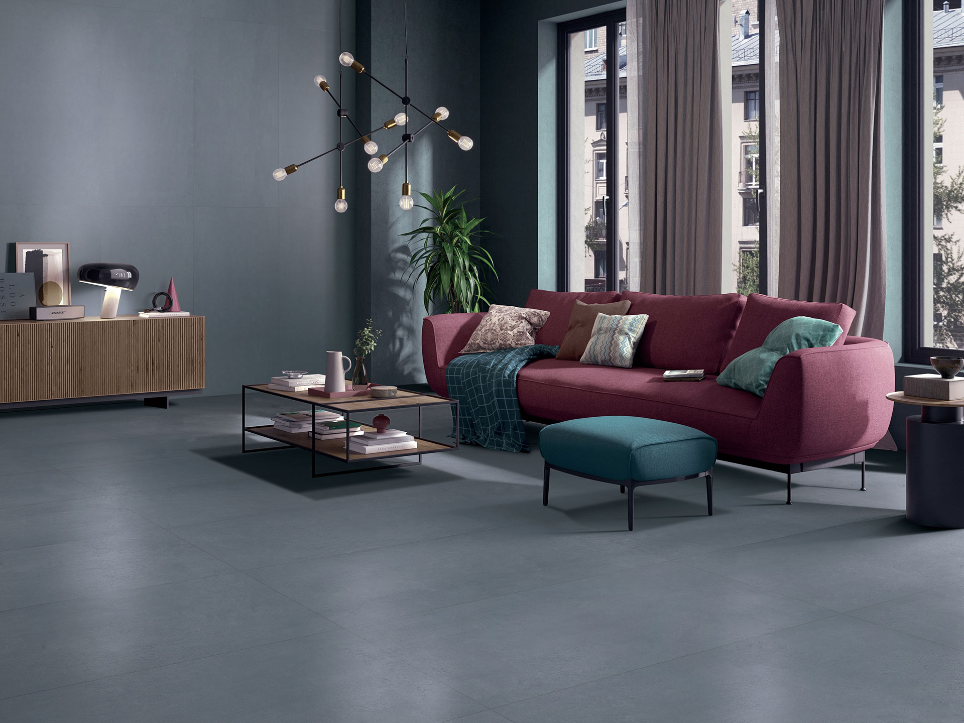
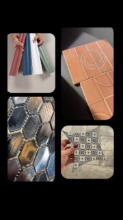
  • A tile can look good on its own. The real test is how it transforms a space.

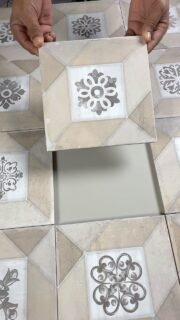
From the linear character of Lumina to the metallic surface of SW-102, the soft presence of Belle Beige, the clean texture of Vestige White, and the decorative detail of Delormo Adrien, each tile brings a different visual direction.

See how  colour, texture, finish and format come together once the tile becomes part of the architecture.

Different surfaces. Different personalities.

Visit website more details: www.timexceramic.com

#TimexCeramic #ImportedTiles #TileDesign #InteriorDesignIndia #WallTile Design
  • Wood, with a more architectural expression.

The Delormo Series brings the warmth and character of wood into tile through a rich mocha-brown colour and a detailed linear grain. Delormo Pira Mocha has a naturally varied surface that gives the wall visual depth while keeping the overall palette warm and understated.

The vertical grain creates a strong sense of direction across the 200 × 200 mm format. Rather than replicating the look of a traditional wood plank, the square tile allows the grain to become part of the overall composition, creating a structured and contemporary surface.

The mocha tone works particularly well with walnut, dark wood, brushed metal and neutral stone. In this bathroom, the tile creates a warm backdrop for the vanity while the repeated grain adds texture without introducing a busy pattern.

A wood-look tile that brings warmth through colour, grain and format.

Delormo Pira Mocha
Finish: Wood-look textured
Application: Wall / Floor
Size: 200 × 200 mm

#TimexCeramic #DelormoSeries #DelormoPiraMocha #WoodLookTiles #BrownTiles
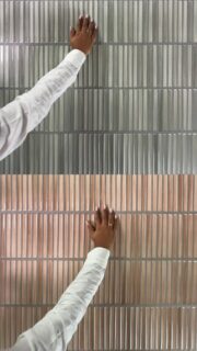
  • A monochromatic wall, made interesting by the way the surface changes.

The Lumina 60 × 246 series brings together two complementary expressions in grey: a clean plain tile and a linear textured version. The colour stays restrained and architectural, allowing the surface variation to become the defining detail.

The plain tile creates a calm, consistent base, while the lined tile introduces a fine vertical rhythm across the wall. Used together, the contrast is subtle but intentional, adding depth without relying on bold pattern or multiple colours.

The 60 × 246 mm format further strengthens that linear character. The elongated proportion works particularly well in contemporary kitchens and backsplashes, where the direction of the lines can be used to create visual continuity and structure.

It is a good example of how one colour, two surfaces and a considered format can create a layered interior.

Lumina
Finish: Plain + Linear textured
Application: Wall
Size: 60 × 246 mm

#TimexCeramic #LuminaSeries #WallTileDesign #KitchenInteriors #TileDesign
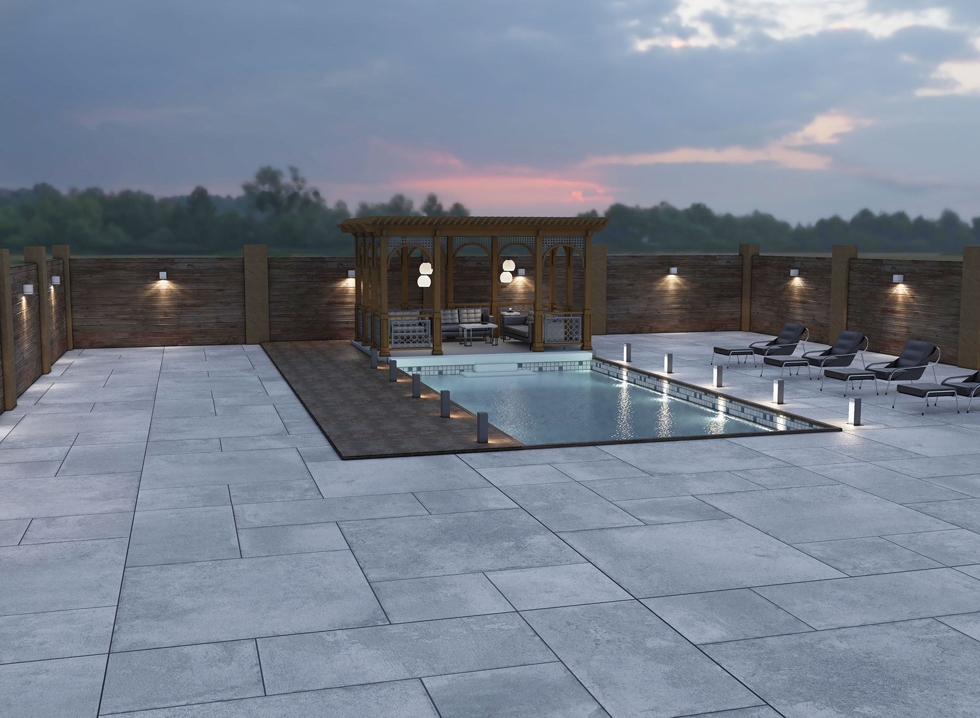
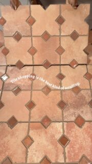
  • If your space feels flat, look down.
The floor might be the missing detail.

The right floor can change the entire feel of a space, adding depth, texture, colour and a stronger sense of proportion without changing the architecture.

Sometimes, the biggest design shift starts under your feet.

#TimexCeramic #FloorTiles #TileDesign #InteriorDesignIndia #ImportedTiles
  • Wood Look. Pattern Mindset.
Delormo Bruno brings the warmth of natural wood together with a geometric layout that creates depth, movement, and visual intrigue.
The repeating design forms a striking focal point while maintaining the versatility of neutral wood tones.
Would you style Delormo Bruno in a cozy home or a contemporary commercial space?
Delormo Bruno
Application: Wall & Floor
Size: 200x200mm
#WoodlookTiles #PatternTiles #DecorativeTiles #WallAndFloorTiles #InteriorDesignindia
  • Yellow, with a little more personality.

Makalu Yellow brings a glossy finish and elongated format to walls and floors, adding a bold yet refined touch to contemporary spaces.

Size: 50 × 500 mm
Finish: Shiny
Use: Wall & Floor

#TimexCeramic #MakaluYellow #ImportedTiles #CeramicTiles #TileDesign
  • Not every tile rule you’ve heard is actually a rule.

From glossy tiles making spaces feel larger to dark tiles making rooms feel smaller, tile selection comes with plenty of common assumptions. But the right answer often depends on the space, application, format, finish and installation.

In this carousel, we’re putting five popular tile beliefs to the test, including whether matte tiles are harder to maintain, whether floor tiles can be used on walls, and whether more grout lines really mean more upkeep.

Good tile design is less about following rules and more about understanding how each choice works within the space.

Save this carousel for your next project, and visit our website to explore tiles designed for considered spaces.

#TileDesign #TileKnowledge #InteriorDesignIndia #ArchitecturalMaterials #TileInspiration
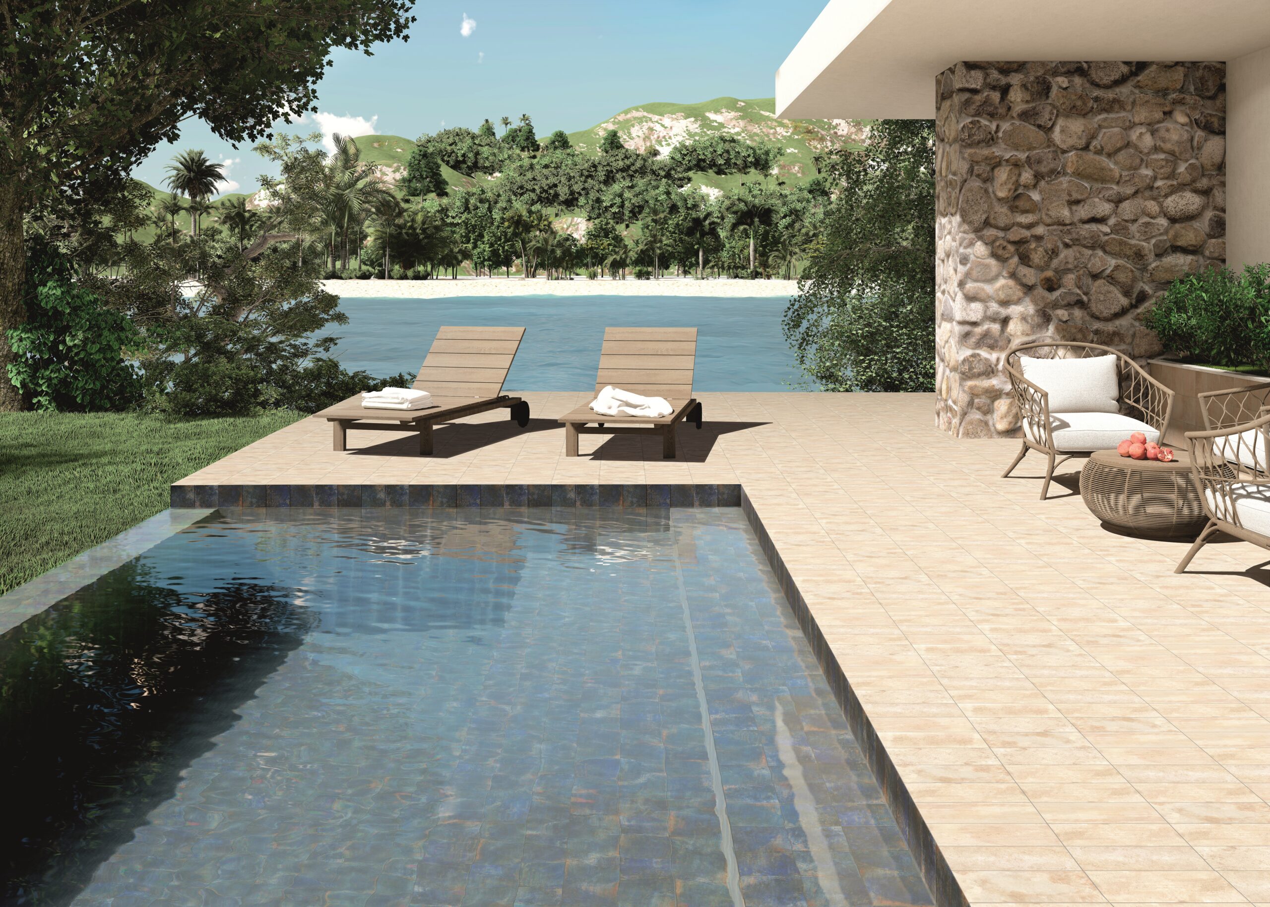
  • Red. Orange. Green. Yellow. Blue. 

Five colours. Different spaces. Five very different ways to make a statement.

Because when colour meets the right tile, the whole space changes.

Which one would you bring home?

#TimexCeramic #ColourfulTiles #ColourInInteriors #TileDesign #DesignerTiles
One tile. Different spaces. A distinctly different character.

The Vestige Series is designed for interiors where the surface needs to bring colour, texture and visual depth without losing a sense of refinement. Its softly weathered green and off-white character gives the tile a natural, lived-in quality that works across a range of design settings.

In the living room, it creates a textured feature wall with a relaxed architectural feel. In the kitchen, the same surface brings colour and character to the backsplash, while in the bathroom it creates a more immersive, layered backdrop.

Its versatility extends beyond residential spaces. Used across hospitality and larger feature installations, the varied green-and-white surface can become a defining architectural element rather than simply a finishing material.

One series. Multiple spaces. Plenty of room for interpretation.

Vestige Series
Finish: Textured / distressed
Application: Wall / Floor

#TimexCeramic #VestigeSeries #GreenTiles #DecorativeTiles #StatementTiles
One tile. Different spaces. A distinctly different character.

The Vestige Series is designed for interiors where the surface needs to bring colour, texture and visual depth without losing a sense of refinement. Its softly weathered green and off-white character gives the tile a natural, lived-in quality that works across a range of design settings.

In the living room, it creates a textured feature wall with a relaxed architectural feel. In the kitchen, the same surface brings colour and character to the backsplash, while in the bathroom it creates a more immersive, layered backdrop.

Its versatility extends beyond residential spaces. Used across hospitality and larger feature installations, the varied green-and-white surface can become a defining architectural element rather than simply a finishing material.

One series. Multiple spaces. Plenty of room for interpretation.

Vestige Series
Finish: Textured / distressed
Application: Wall / Floor

#TimexCeramic #VestigeSeries #GreenTiles #DecorativeTiles #StatementTiles
One tile. Different spaces. A distinctly different character.

The Vestige Series is designed for interiors where the surface needs to bring colour, texture and visual depth without losing a sense of refinement. Its softly weathered green and off-white character gives the tile a natural, lived-in quality that works across a range of design settings.

In the living room, it creates a textured feature wall with a relaxed architectural feel. In the kitchen, the same surface brings colour and character to the backsplash, while in the bathroom it creates a more immersive, layered backdrop.

Its versatility extends beyond residential spaces. Used across hospitality and larger feature installations, the varied green-and-white surface can become a defining architectural element rather than simply a finishing material.

One series. Multiple spaces. Plenty of room for interpretation.

Vestige Series
Finish: Textured / distressed
Application: Wall / Floor

#TimexCeramic #VestigeSeries #GreenTiles #DecorativeTiles #StatementTiles
One tile. Different spaces. A distinctly different character.

The Vestige Series is designed for interiors where the surface needs to bring colour, texture and visual depth without losing a sense of refinement. Its softly weathered green and off-white character gives the tile a natural, lived-in quality that works across a range of design settings.

In the living room, it creates a textured feature wall with a relaxed architectural feel. In the kitchen, the same surface brings colour and character to the backsplash, while in the bathroom it creates a more immersive, layered backdrop.

Its versatility extends beyond residential spaces. Used across hospitality and larger feature installations, the varied green-and-white surface can become a defining architectural element rather than simply a finishing material.

One series. Multiple spaces. Plenty of room for interpretation.

Vestige Series
Finish: Textured / distressed
Application: Wall / Floor

#TimexCeramic #VestigeSeries #GreenTiles #DecorativeTiles #StatementTiles
One tile. Different spaces. A distinctly different character.

The Vestige Series is designed for interiors where the surface needs to bring colour, texture and visual depth without losing a sense of refinement. Its softly weathered green and off-white character gives the tile a natural, lived-in quality that works across a range of design settings.

In the living room, it creates a textured feature wall with a relaxed architectural feel. In the kitchen, the same surface brings colour and character to the backsplash, while in the bathroom it creates a more immersive, layered backdrop.

Its versatility extends beyond residential spaces. Used across hospitality and larger feature installations, the varied green-and-white surface can become a defining architectural element rather than simply a finishing material.

One series. Multiple spaces. Plenty of room for interpretation.

Vestige Series
Finish: Textured / distressed
Application: Wall / Floor

#TimexCeramic #VestigeSeries #GreenTiles #DecorativeTiles #StatementTiles
One tile. Different spaces. A distinctly different character.

The Vestige Series is designed for interiors where the surface needs to bring colour, texture and visual depth without losing a sense of refinement. Its softly weathered green and off-white character gives the tile a natural, lived-in quality that works across a range of design settings.

In the living room, it creates a textured feature wall with a relaxed architectural feel. In the kitchen, the same surface brings colour and character to the backsplash, while in the bathroom it creates a more immersive, layered backdrop.

Its versatility extends beyond residential spaces. Used across hospitality and larger feature installations, the varied green-and-white surface can become a defining architectural element rather than simply a finishing material.

One series. Multiple spaces. Plenty of room for interpretation.

Vestige Series
Finish: Textured / distressed
Application: Wall / Floor

#TimexCeramic #VestigeSeries #GreenTiles #DecorativeTiles #StatementTiles
One tile. Different spaces. A distinctly different character. The Vestige Series is designed for interiors where the surface needs to bring colour, texture and visual depth without losing a sense of refinement. Its softly weathered green and off-white character gives the tile a natural, lived-in quality that works across a range of design settings. In the living room, it creates a textured feature wall with a relaxed architectural feel. In the kitchen, the same surface brings colour and character to the backsplash, while in the bathroom it creates a more immersive, layered backdrop. Its versatility extends beyond residential spaces. Used across hospitality and larger feature installations, the varied green-and-white surface can become a defining architectural element rather than simply a finishing material. One series. Multiple spaces. Plenty of room for interpretation. Vestige Series Finish: Textured / distressed Application: Wall / Floor #TimexCeramic #VestigeSeries #GreenTiles #DecorativeTiles #StatementTiles
2 days ago
View on Instagram |
1/9
A tile can look good on its own. The real test is how it transforms a space. From the linear character of Lumina to the metallic surface of SW-102, the soft presence of Belle Beige, the clean texture of Vestige White, and the decorative detail of Delormo Adrien, each tile brings a different visual direction. See how colour, texture, finish and format come together once the tile becomes part of the architecture. Different surfaces. Different personalities. Visit website more details: www.timexceramic.com #TimexCeramic #ImportedTiles #TileDesign #InteriorDesignIndia #WallTile Design
3 days ago
View on Instagram |
2/9
Wood, with a more architectural expression.

The Delormo Series brings the warmth and character of wood into tile through a rich mocha-brown colour and a detailed linear grain. Delormo Pira Mocha has a naturally varied surface that gives the wall visual depth while keeping the overall palette warm and understated.

The vertical grain creates a strong sense of direction across the 200 × 200 mm format. Rather than replicating the look of a traditional wood plank, the square tile allows the grain to become part of the overall composition, creating a structured and contemporary surface.

The mocha tone works particularly well with walnut, dark wood, brushed metal and neutral stone. In this bathroom, the tile creates a warm backdrop for the vanity while the repeated grain adds texture without introducing a busy pattern.

A wood-look tile that brings warmth through colour, grain and format.

Delormo Pira Mocha
Finish: Wood-look textured
Application: Wall / Floor
Size: 200 × 200 mm

#TimexCeramic #DelormoSeries #DelormoPiraMocha #WoodLookTiles #BrownTiles
Wood, with a more architectural expression. The Delormo Series brings the warmth and character of wood into tile through a rich mocha-brown colour and a detailed linear grain. Delormo Pira Mocha has a naturally varied surface that gives the wall visual depth while keeping the overall palette warm and understated. The vertical grain creates a strong sense of direction across the 200 × 200 mm format. Rather than replicating the look of a traditional wood plank, the square tile allows the grain to become part of the overall composition, creating a structured and contemporary surface. The mocha tone works particularly well with walnut, dark wood, brushed metal and neutral stone. In this bathroom, the tile creates a warm backdrop for the vanity while the repeated grain adds texture without introducing a busy pattern. A wood-look tile that brings warmth through colour, grain and format. Delormo Pira Mocha Finish: Wood-look textured Application: Wall / Floor Size: 200 × 200 mm #TimexCeramic #DelormoSeries #DelormoPiraMocha #WoodLookTiles #BrownTiles
4 days ago
View on Instagram |
3/9
A monochromatic wall, made interesting by the way the surface changes.

The Lumina 60 × 246 series brings together two complementary expressions in grey: a clean plain tile and a linear textured version. The colour stays restrained and architectural, allowing the surface variation to become the defining detail.

The plain tile creates a calm, consistent base, while the lined tile introduces a fine vertical rhythm across the wall. Used together, the contrast is subtle but intentional, adding depth without relying on bold pattern or multiple colours.

The 60 × 246 mm format further strengthens that linear character. The elongated proportion works particularly well in contemporary kitchens and backsplashes, where the direction of the lines can be used to create visual continuity and structure.

It is a good example of how one colour, two surfaces and a considered format can create a layered interior.

Lumina
Finish: Plain + Linear textured
Application: Wall
Size: 60 × 246 mm

#TimexCeramic #LuminaSeries #WallTileDesign #KitchenInteriors #TileDesign
A monochromatic wall, made interesting by the way the surface changes. The Lumina 60 × 246 series brings together two complementary expressions in grey: a clean plain tile and a linear textured version. The colour stays restrained and architectural, allowing the surface variation to become the defining detail. The plain tile creates a calm, consistent base, while the lined tile introduces a fine vertical rhythm across the wall. Used together, the contrast is subtle but intentional, adding depth without relying on bold pattern or multiple colours. The 60 × 246 mm format further strengthens that linear character. The elongated proportion works particularly well in contemporary kitchens and backsplashes, where the direction of the lines can be used to create visual continuity and structure. It is a good example of how one colour, two surfaces and a considered format can create a layered interior. Lumina Finish: Plain + Linear textured Application: Wall Size: 60 × 246 mm #TimexCeramic #LuminaSeries #WallTileDesign #KitchenInteriors #TileDesign
5 days ago
View on Instagram |
4/9
If your space feels flat, look down. The floor might be the missing detail. The right floor can change the entire feel of a space, adding depth, texture, colour and a stronger sense of proportion without changing the architecture. Sometimes, the biggest design shift starts under your feet. #TimexCeramic #FloorTiles #TileDesign #InteriorDesignIndia #ImportedTiles
6 days ago
View on Instagram |
5/9
Wood Look. Pattern Mindset.
Delormo Bruno brings the warmth of natural wood together with a geometric layout that creates depth, movement, and visual intrigue.
The repeating design forms a striking focal point while maintaining the versatility of neutral wood tones.
Would you style Delormo Bruno in a cozy home or a contemporary commercial space?
Delormo Bruno
Application: Wall & Floor
Size: 200x200mm
#WoodlookTiles #PatternTiles #DecorativeTiles #WallAndFloorTiles #InteriorDesignindia
Wood Look. Pattern Mindset. Delormo Bruno brings the warmth of natural wood together with a geometric layout that creates depth, movement, and visual intrigue. The repeating design forms a striking focal point while maintaining the versatility of neutral wood tones. Would you style Delormo Bruno in a cozy home or a contemporary commercial space? Delormo Bruno Application: Wall & Floor Size: 200x200mm #WoodlookTiles #PatternTiles #DecorativeTiles #WallAndFloorTiles #InteriorDesignindia
7 days ago
View on Instagram |
6/9
Yellow, with a little more personality. Makalu Yellow brings a glossy finish and elongated format to walls and floors, adding a bold yet refined touch to contemporary spaces. Size: 50 × 500 mm Finish: Shiny Use: Wall & Floor #TimexCeramic #MakaluYellow #ImportedTiles #CeramicTiles #TileDesign
1 week ago
View on Instagram |
7/9
Not every tile rule you’ve heard is actually a rule.

From glossy tiles making spaces feel larger to dark tiles making rooms feel smaller, tile selection comes with plenty of common assumptions. But the right answer often depends on the space, application, format, finish and installation.

In this carousel, we’re putting five popular tile beliefs to the test, including whether matte tiles are harder to maintain, whether floor tiles can be used on walls, and whether more grout lines really mean more upkeep.

Good tile design is less about following rules and more about understanding how each choice works within the space.

Save this carousel for your next project, and visit our website to explore tiles designed for considered spaces.

#TileDesign #TileKnowledge #InteriorDesignIndia #ArchitecturalMaterials #TileInspiration
Not every tile rule you’ve heard is actually a rule.

From glossy tiles making spaces feel larger to dark tiles making rooms feel smaller, tile selection comes with plenty of common assumptions. But the right answer often depends on the space, application, format, finish and installation.

In this carousel, we’re putting five popular tile beliefs to the test, including whether matte tiles are harder to maintain, whether floor tiles can be used on walls, and whether more grout lines really mean more upkeep.

Good tile design is less about following rules and more about understanding how each choice works within the space.

Save this carousel for your next project, and visit our website to explore tiles designed for considered spaces.

#TileDesign #TileKnowledge #InteriorDesignIndia #ArchitecturalMaterials #TileInspiration
Not every tile rule you’ve heard is actually a rule.

From glossy tiles making spaces feel larger to dark tiles making rooms feel smaller, tile selection comes with plenty of common assumptions. But the right answer often depends on the space, application, format, finish and installation.

In this carousel, we’re putting five popular tile beliefs to the test, including whether matte tiles are harder to maintain, whether floor tiles can be used on walls, and whether more grout lines really mean more upkeep.

Good tile design is less about following rules and more about understanding how each choice works within the space.

Save this carousel for your next project, and visit our website to explore tiles designed for considered spaces.

#TileDesign #TileKnowledge #InteriorDesignIndia #ArchitecturalMaterials #TileInspiration
Not every tile rule you’ve heard is actually a rule.

From glossy tiles making spaces feel larger to dark tiles making rooms feel smaller, tile selection comes with plenty of common assumptions. But the right answer often depends on the space, application, format, finish and installation.

In this carousel, we’re putting five popular tile beliefs to the test, including whether matte tiles are harder to maintain, whether floor tiles can be used on walls, and whether more grout lines really mean more upkeep.

Good tile design is less about following rules and more about understanding how each choice works within the space.

Save this carousel for your next project, and visit our website to explore tiles designed for considered spaces.

#TileDesign #TileKnowledge #InteriorDesignIndia #ArchitecturalMaterials #TileInspiration
Not every tile rule you’ve heard is actually a rule.

From glossy tiles making spaces feel larger to dark tiles making rooms feel smaller, tile selection comes with plenty of common assumptions. But the right answer often depends on the space, application, format, finish and installation.

In this carousel, we’re putting five popular tile beliefs to the test, including whether matte tiles are harder to maintain, whether floor tiles can be used on walls, and whether more grout lines really mean more upkeep.

Good tile design is less about following rules and more about understanding how each choice works within the space.

Save this carousel for your next project, and visit our website to explore tiles designed for considered spaces.

#TileDesign #TileKnowledge #InteriorDesignIndia #ArchitecturalMaterials #TileInspiration
Not every tile rule you’ve heard is actually a rule.

From glossy tiles making spaces feel larger to dark tiles making rooms feel smaller, tile selection comes with plenty of common assumptions. But the right answer often depends on the space, application, format, finish and installation.

In this carousel, we’re putting five popular tile beliefs to the test, including whether matte tiles are harder to maintain, whether floor tiles can be used on walls, and whether more grout lines really mean more upkeep.

Good tile design is less about following rules and more about understanding how each choice works within the space.

Save this carousel for your next project, and visit our website to explore tiles designed for considered spaces.

#TileDesign #TileKnowledge #InteriorDesignIndia #ArchitecturalMaterials #TileInspiration
Not every tile rule you’ve heard is actually a rule.

From glossy tiles making spaces feel larger to dark tiles making rooms feel smaller, tile selection comes with plenty of common assumptions. But the right answer often depends on the space, application, format, finish and installation.

In this carousel, we’re putting five popular tile beliefs to the test, including whether matte tiles are harder to maintain, whether floor tiles can be used on walls, and whether more grout lines really mean more upkeep.

Good tile design is less about following rules and more about understanding how each choice works within the space.

Save this carousel for your next project, and visit our website to explore tiles designed for considered spaces.

#TileDesign #TileKnowledge #InteriorDesignIndia #ArchitecturalMaterials #TileInspiration
Not every tile rule you’ve heard is actually a rule.

From glossy tiles making spaces feel larger to dark tiles making rooms feel smaller, tile selection comes with plenty of common assumptions. But the right answer often depends on the space, application, format, finish and installation.

In this carousel, we’re putting five popular tile beliefs to the test, including whether matte tiles are harder to maintain, whether floor tiles can be used on walls, and whether more grout lines really mean more upkeep.

Good tile design is less about following rules and more about understanding how each choice works within the space.

Save this carousel for your next project, and visit our website to explore tiles designed for considered spaces.

#TileDesign #TileKnowledge #InteriorDesignIndia #ArchitecturalMaterials #TileInspiration
Not every tile rule you’ve heard is actually a rule. From glossy tiles making spaces feel larger to dark tiles making rooms feel smaller, tile selection comes with plenty of common assumptions. But the right answer often depends on the space, application, format, finish and installation. In this carousel, we’re putting five popular tile beliefs to the test, including whether matte tiles are harder to maintain, whether floor tiles can be used on walls, and whether more grout lines really mean more upkeep. Good tile design is less about following rules and more about understanding how each choice works within the space. Save this carousel for your next project, and visit our website to explore tiles designed for considered spaces. #TileDesign #TileKnowledge #InteriorDesignIndia #ArchitecturalMaterials #TileInspiration
1 week ago
View on Instagram |
8/9
Red. Orange. Green. Yellow. Blue. Five colours. Different spaces. Five very different ways to make a statement. Because when colour meets the right tile, the whole space changes. Which one would you bring home? #TimexCeramic #ColourfulTiles #ColourInInteriors #TileDesign #DesignerTiles
1 week ago
View on Instagram |
9/9

Like us on Facebook

Facebook Page Plugin – Clean Full Section

Shopping cart

0
image/svg+xml

No products in the cart.

Continue Shopping