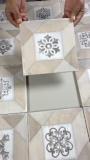
Before we notice texture or form, we feel colour. It is instinctive, emotional, and immediate. The blue that slows your heart rate. The terracotta that makes a large room feel intimate. The ivory that lets a cluttered mind exhale.
A designer’s mastery lies not just in applying colour (see our guide on Colour Drenching: The Art of Monochrome for application techniques), but in choosing the right emotion for the space. Tiles are permanent colour; unlike paint, they do not fade or flatline. They hold the mood for decades.
1. The Mood of Calm: Biophilic Greens & Blues
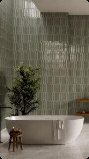
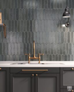
Serenity is a spectrum. It lives in the cool tones that mimic nature, sea-glass, sage, and washed indigo. These hues visually push walls outward, diffusing edges and softening the harshness of artificial light.
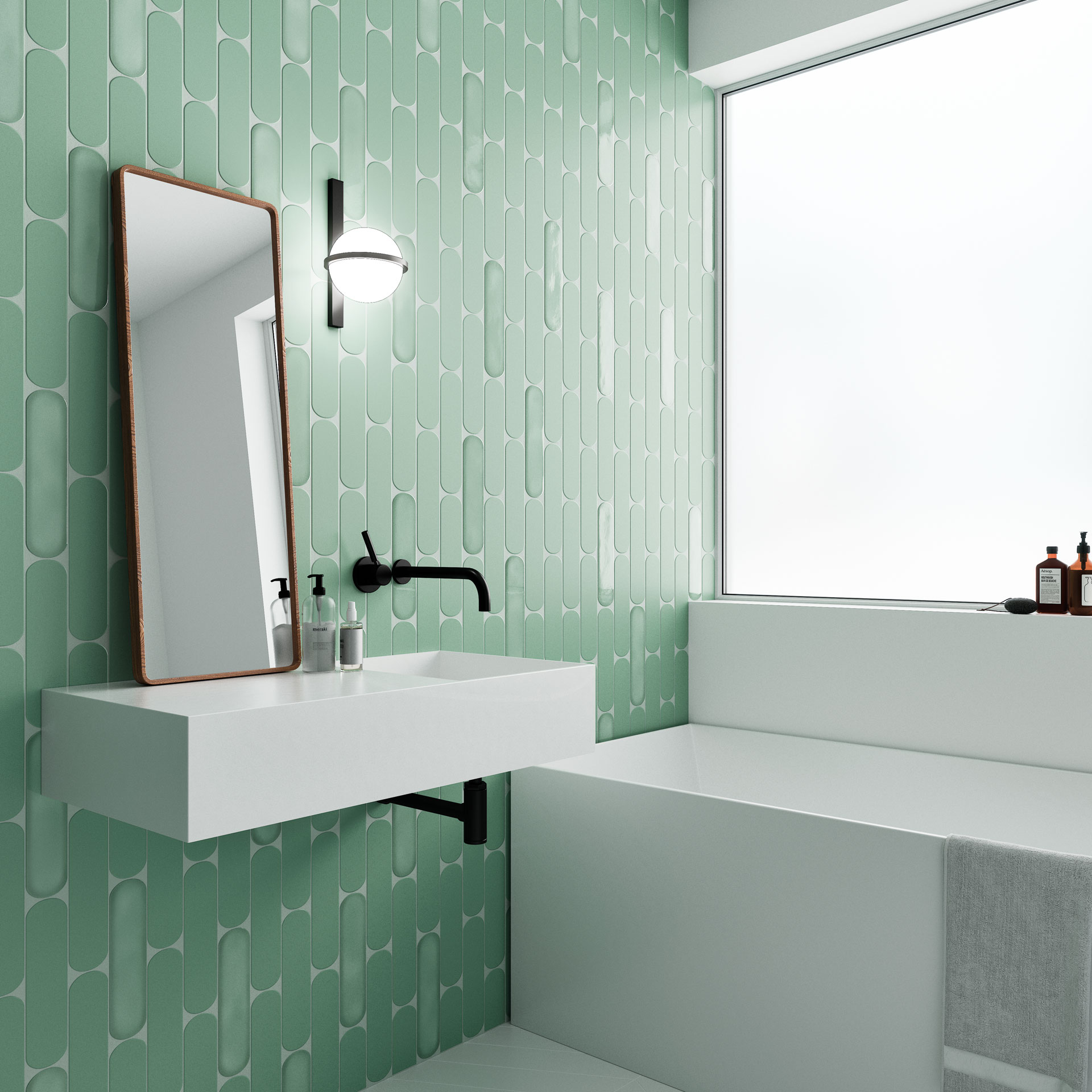
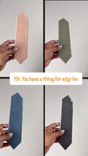
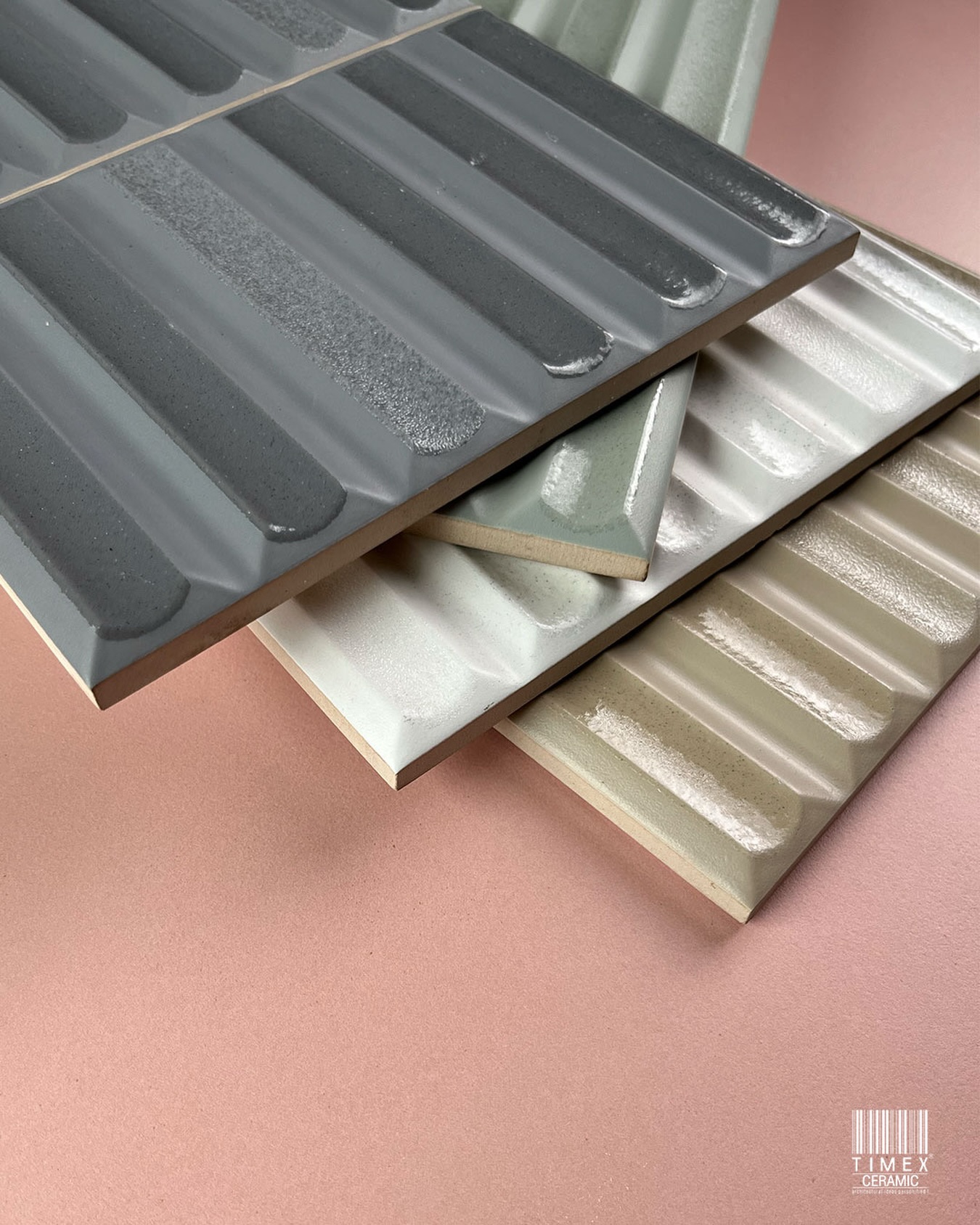
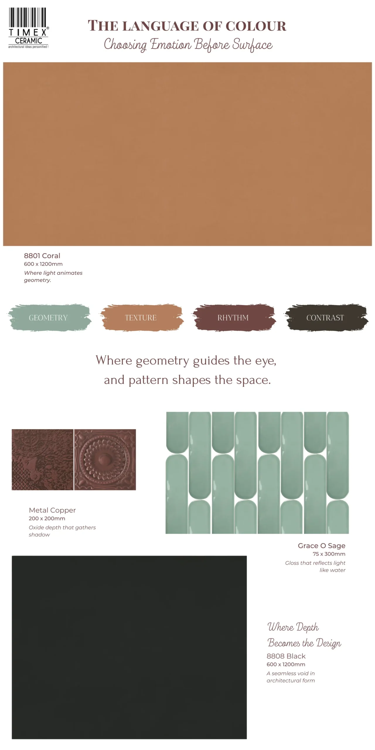
- The Water Colour Effect: The Grace O Series captures the translucency of water.
Design Move: In a compact bathroom or a north-facing bedroom, use the Aqua or Mint glazes. Because the surface is glossy, it reflects light like a pool, turning a small, windowless space into a breathable sanctuary.
2. The Mood of Energy: Earth, Oxide & Warmth
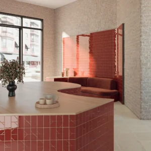
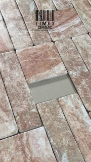
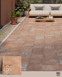
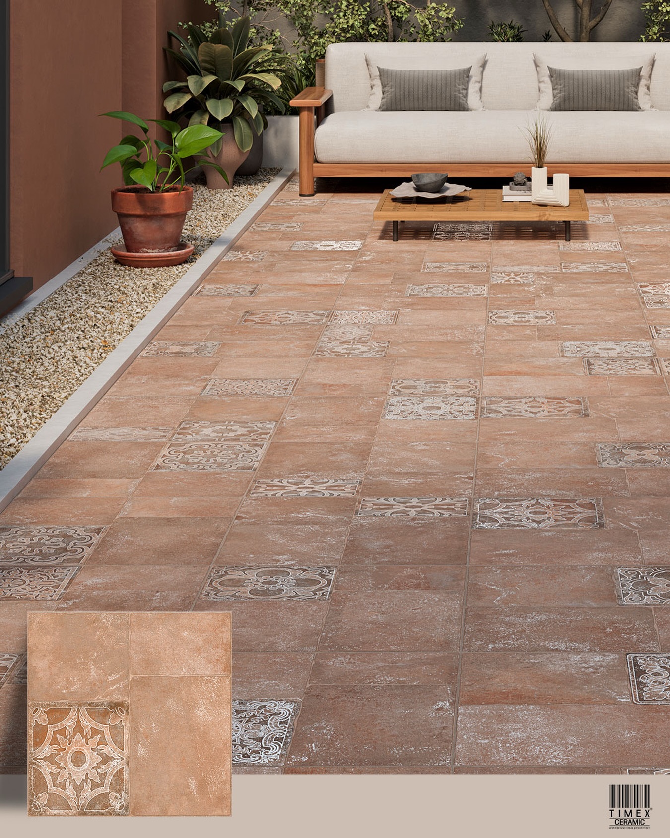
Warmth draws people together. While cool tones expand a room, warm tones (ochre, rust, terracotta) act as a hearth. They ground the space and encourage conversation.
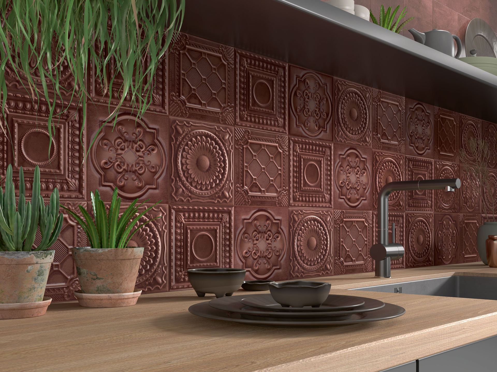
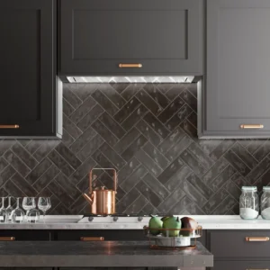
- The Industrial Warmth: For a modern take on warmth, look to the Oxide tones in our Metal Series.
- Design Move: Unlike flat orange paint, a metallic rust or bronze tile reacts to movement. It holds shadows and catches highlights. Use this on a kitchen backsplash or a living room feature wall to create a social hub that feels alive and dynamic.
- Design Move: Unlike flat orange paint, a metallic rust or bronze tile reacts to movement. It holds shadows and catches highlights. Use this on a kitchen backsplash or a living room feature wall to create a social hub that feels alive and dynamic.
- Internal Link: Colour provides the mood, but shape provides the rhythm. To understand how to balance warm colours with strong layouts, read our guide on The Geometry of Presence.
3. The Mood of Drama: Saturated Depth & Contrast
Darkness is not gloomy; it is dramatic. In 2026, we are moving away from safe beiges toward High-Contrast Colour Blocking, using deep, saturated tones to create distinct architectural zones.
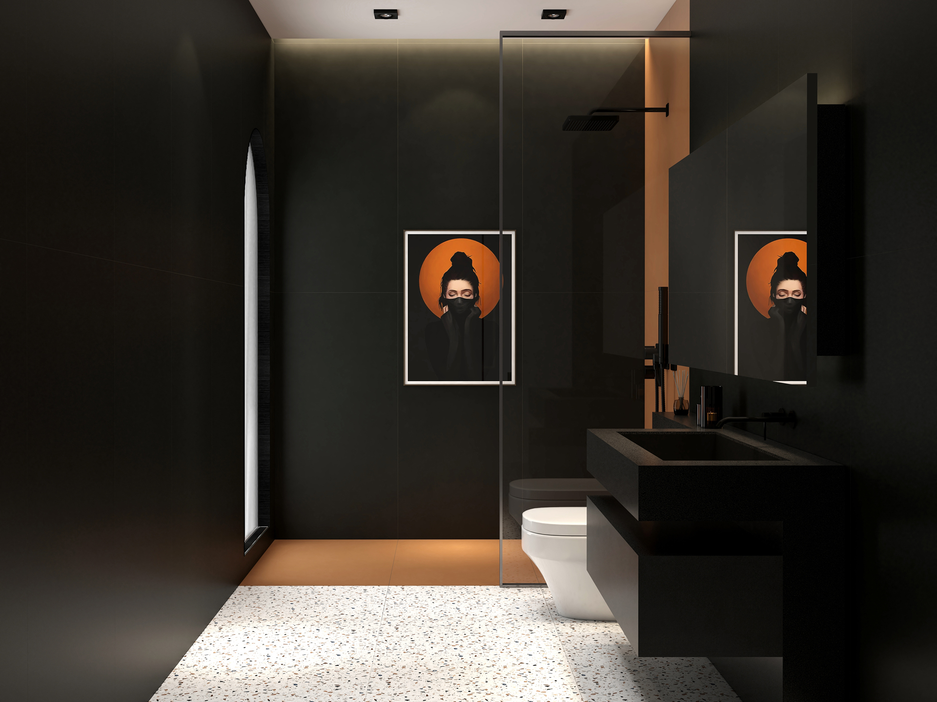
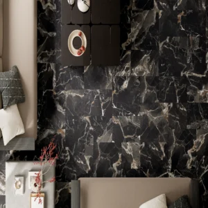
- The Seamless Void: The 8801-08 Series offers a deep, matte black finish in a large 600x1200mm format.
- Design Move: Don’t be afraid of the dark. Use these large slabs to create a visual void in a powder room or shower. Because the format is massive, grout lines virtually disappear, making the walls look like a single, continuous sheet of velvet.
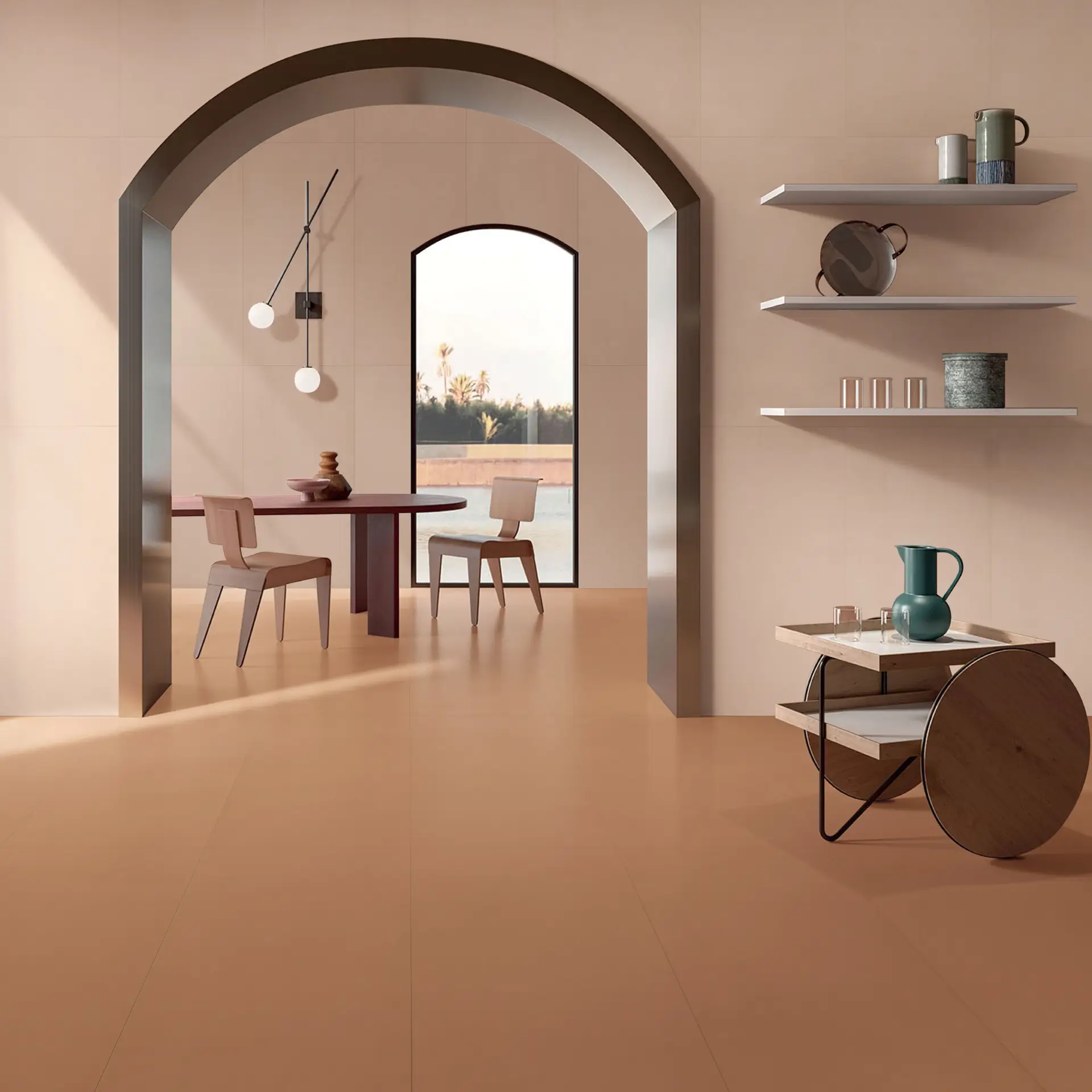
- The Contrast: As seen in the image, pairing this deep black with a vibrant accent like Coral prevents the room from feeling heavy. It turns the space into high-fashion architecture.
- Design Move: Don’t be afraid of the dark. Use these large slabs to create a visual void in a powder room or shower. Because the format is massive, grout lines virtually disappear, making the walls look like a single, continuous sheet of velvet.
Colour is not just cosmetic; it is spatial. It dictates how large a room feels, how light behaves, and how the mind rests. When you choose a palette based on emotion rather than trend, you aren’t just decorating, you are curating an atmosphere. A home shouldn’t just look good; it should feel right.
Found your palette? Explore the Grace O, Metal, & 8801 Collections online, or visit our Mumbai Experience Centre to see how these glazes react to natural light.