How to Master Monochrome Tile Palettes with the Colour Drenching Effect
Monochrome interiors are often mistaken for being plain or uninspired. In reality, when applied with intention, they create one of the most sophisticated design statements: the colour-drenching effect. This approach employs a single hue, saturating the space with it, to create an immersive environment that feels refined, bold, and timeless.
What is Colour Drenching?
Colour drenching is the art of designing with one dominant hue, carrying it across walls, floors, and architectural surfaces. Instead of seeking contrast, it builds harmony by using subtle variations in undertones, finishes, and form to achieve depth and interest. When paired with our luxury imported tile collection, this technique amplifies both elegance and durability, making even a minimal palette feel luxurious.

The Foundation: Choosing Your Hero Hue
The success of this technique lies in choosing a colour with intention. Every hue sets a tone-deep emeralds exude luxury and calm, blush tones create warmth, while midnight navy feels dramatic and modern. Your “hero hue” becomes the emotional anchor of the design.
For homeowners exploring interior design tiles for luxury homes, the hero hue isn’t just about colour-it’s about personality. The right tile finish, whether chosen for a living room centrepiece or a monochrome bathroom, sets the mood of the space.
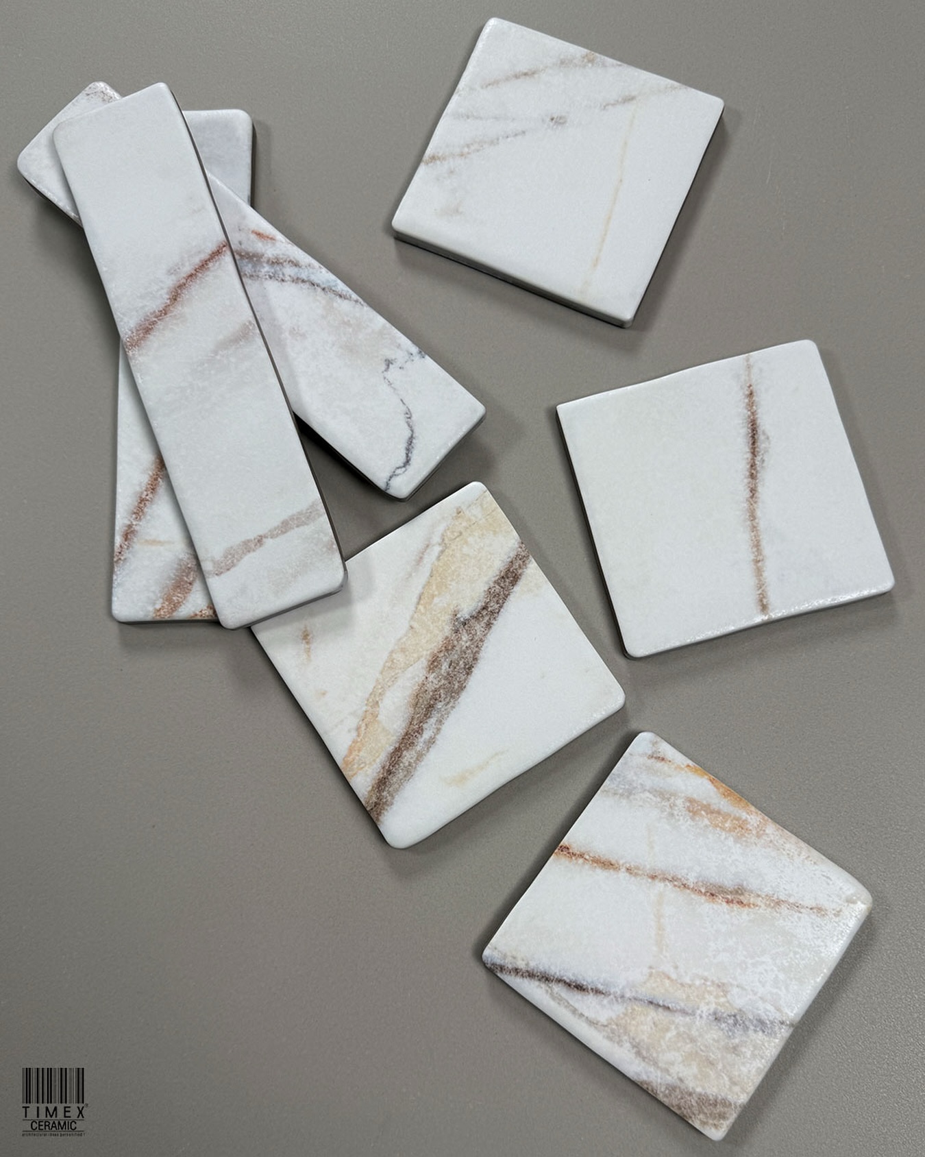
The Role of Undertones
A single colour is never just one shade. Cool whites evoke a crisp and modern feel, while warm whites convey a sense of softness. Likewise, greens, blues, or greys can shift dramatically with undertones. Recognising and layering these subtleties prevents the design from appearing sterile.
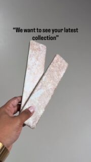
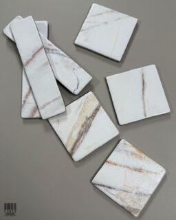
Discover how subtle shifts in tone, like the difference between warm ivory and cool pearl, can transform a room’s atmosphere. Explore undertone-rich collections such as Grace O or Genuine, where every shade is designed to bring depth and dimension to a monochrome palette.

The Near-Monochrome Trick
If pure monochrome feels too rigid, lean into “near-monochrome.” Pair colours that sit very close on the colour wheel-charcoal with smoke grey, or cobalt with navy. These variations add quiet depth while maintaining a cohesive palette. This trick works beautifully in spaces like designer kitchens, where imported kitchen backsplash tiles can introduce subtle tonal shifts without breaking the monochrome flow.
Sometimes the boldest statements come from almost identical hues. Pair deep navy with cobalt, or charcoal with slate to create quiet layers of complexity. Collections like Iqono and the 8800 series are crafted to let these near-monochrome pairings shine.

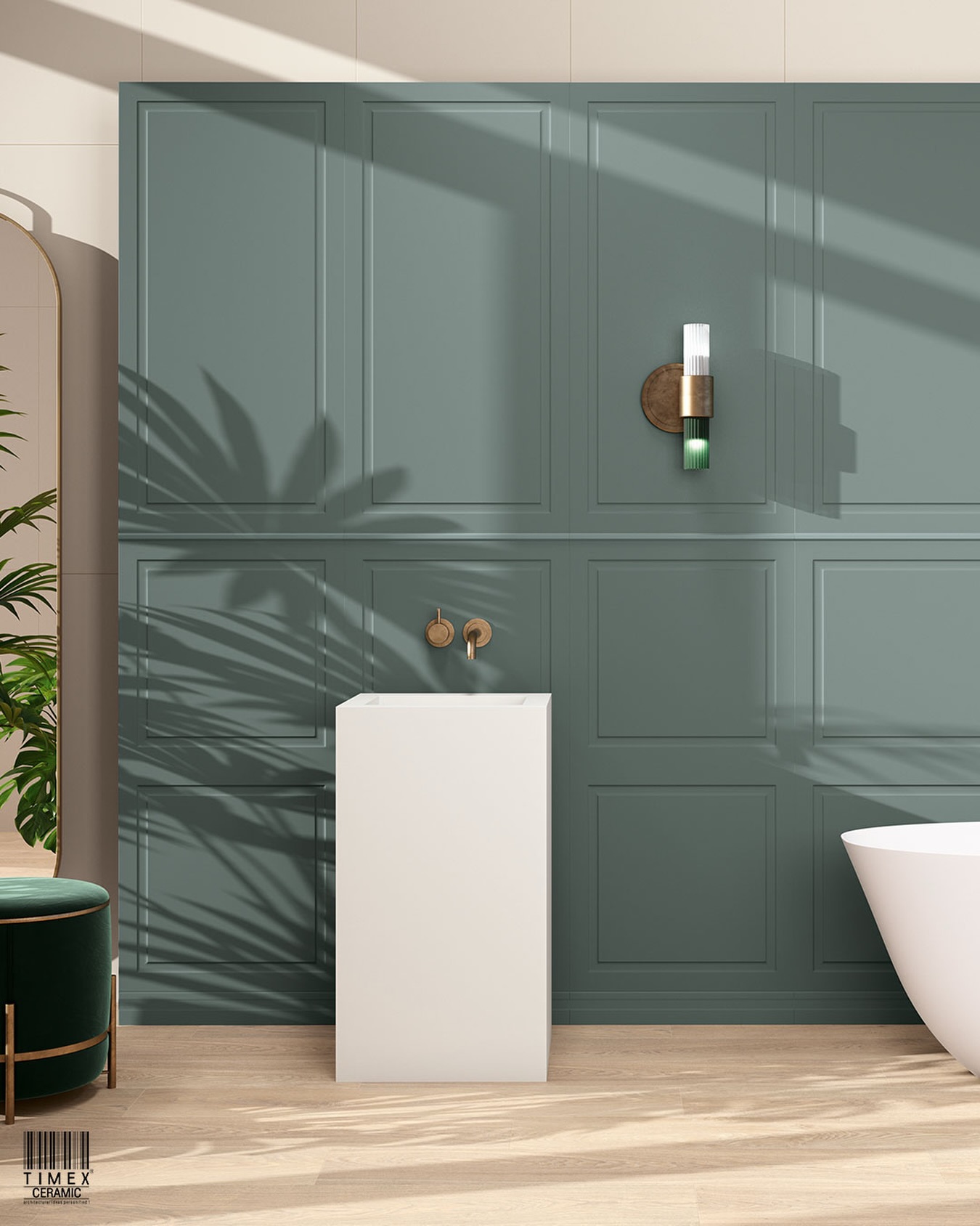
Texture, Finish, and Form: Preventing Flatness
Matte vs. Glossy
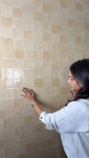
Finish is where monochrome tiles shine. Matte tiles absorb light, creating velvety softness, while glossy surfaces reflect and amplify it, adding polish. Combining both matte wall tiles with glossy floor tiles instantly layers the look.
Light isn’t just reflected—it’s shaped. Mixing matte and glossy finishes transforms a single hue into an evolving experience as the day changes. The Rebels and Iqono tile series offer finishes designed to play with light and mood.

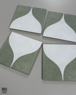
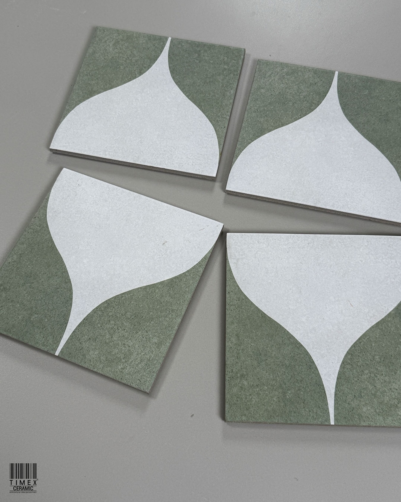
Form and Layout
Shape and pattern are architectural tools by themselves. Octagonal tiles, herringbone tile layouts, or even classic subway tiles used in unexpected orientations create movement and interest. The layout becomes part of the design narrative, reinforcing that monochrome is far from monotonous. Pairing these design strategies with statement pieces like floor tiles for designer living rooms can make even the simplest colour palette feel dynamic.
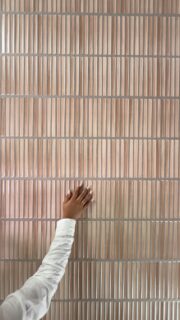
Texture as a Design Tool
Surface texture can transform a monochrome scheme. Handcrafted Zellige tiles, featuring ridged or fluted designs, or those with subtle relief, create rhythm and visual intrigue. Light plays differently across each surface, ensuring the palette never feels flat.
Texture is what turns a flat surface into a living canvas. From handcrafted zellige-inspired finishes to fluted details that catch the light, texture adds rhythm to monochrome spaces. The Genuine and Musa series embrace these tactile qualities, proving that touch is just as important as tone.

Bringing It All Together
The colour-drenching effect proves that the boldest interiors don’t always shout with colour—instead, they whisper with confidence. Monochrome isn’t monotonous; it’s a masterclass in detail, where every finish, texture, and grout line plays a role in shaping a space that feels both timeless and modern.
Inspired to bring this refined design language into your own home? Explore the Timex Ceramics’ Spanish tiles showroom in Mumbai, where thoughtfully curated collections of luxury tiles highlight the depth, texture, and tonal harmony that make monochrome interiors unforgettable. With the right surfaces and expert guidance, your next masterpiece in tile design is just a step away.