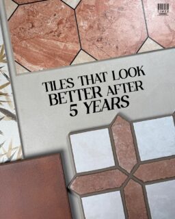
Exploring the Cotto Format Story, where timeless clay meets the modern Mocha trend.
Trends often come and go, but some materials are foundational. Before Mocha was a trending Pantone palette, it was Clay, the oldest building material in history.
At Timex Ceramic, our latest curation: The Cotto Format Story, explores this journey from earth to architecture. We didn’t choose these tiles because they matched a trend; we chose them because they represent the grounding force every modern home needs.
However, it is no coincidence that the design world has caught up. Pantone’s 2025 Mocha palette, filled with toasted caramels and warm neutrals, mirrors exactly what we see in our Cotto collection: a return to warmth, texture, and lived-in luxury.
Here’s how the Timex Cotto Collection brings Mocha Magic to life through material, tone, and format.
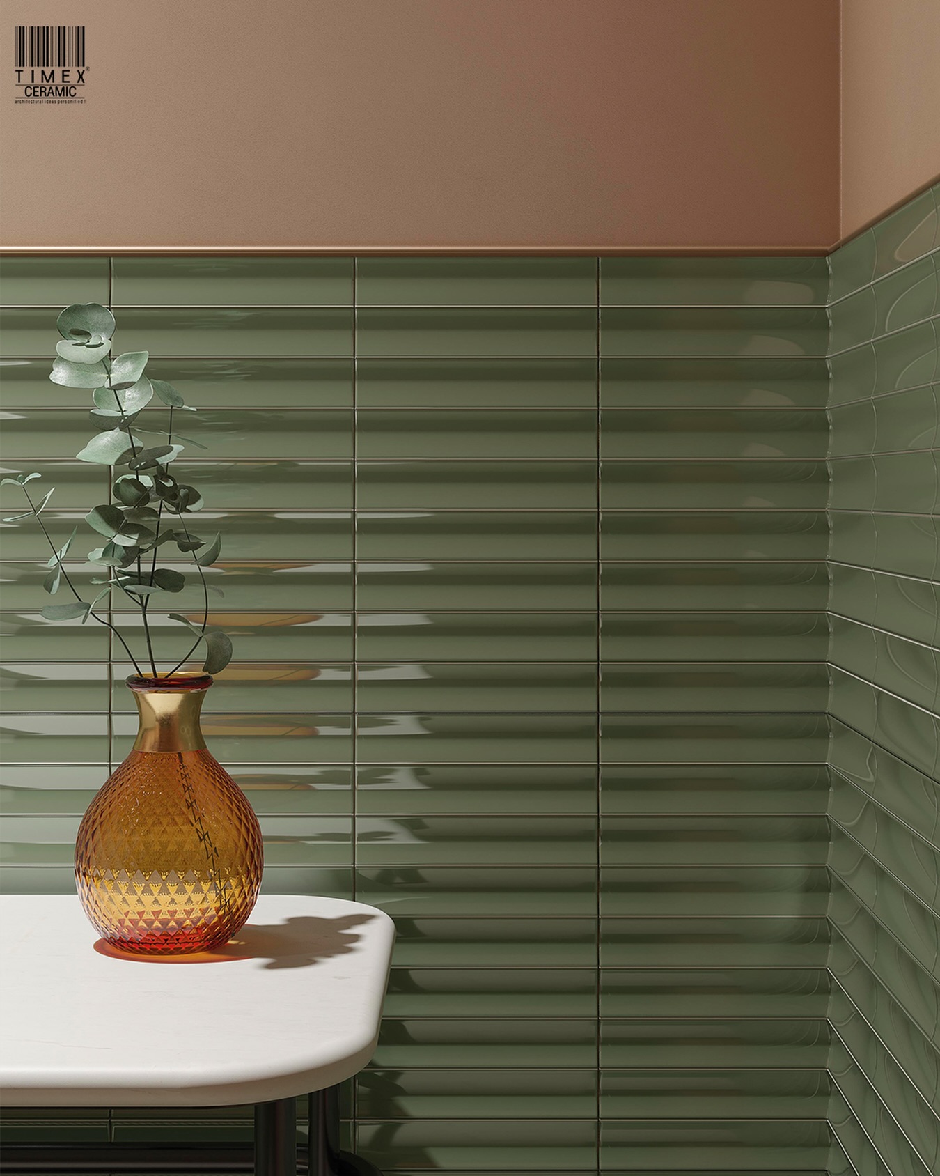
Morning light settles across the room, sliding softly over mocha-toned flooring. The walls, wrapped in warm taupe, soften the edges of the space and give everything a calm, grounded presence. Instead of brightening for show, the palette absorbs just enough of the surroundings to create a lived-in warmth. Here, material, tone, and texture don’t decorate the space, they shape its atmosphere.
Paired with the right imported ceramic tiles, these shades translate effortlessly into kitchens, foyers, and living rooms, creating rooms that feel slower, warmer, and more intentional. Spaces that invite you to slow down, sink in, and stay a while.
1. A Palette That Grounds: The Psychology of Clay
“Cotto evolves beyond its rustic roots, embracing warm, architectural tones that balance comfort with modern calm.”
While the world looks toward the airy whites of 2026 (as explored in our Cloud Dancer design edit), interiors still need a foundation. Mocha and Clay tones strike a rare balance; they comfort without overwhelming.
● Rooted Comfort: Earthy browns and creamy taupes echo the natural textures of wood, stone, and soil, creating interiors that cocoon. These tones work beautifully with wooden floor texture tiles, allowing designers to craft spaces that feel tactile and layered.
● Everyday Indulgence: These are the colours of your favourite latte, or morning coffee ritual. They bring a subtle sense of indulgence and familiarity into spaces, inviting you to slow down.
● Timeless Sophistication: Unlike fleeting bold colours, mocha tones have a classic, enduring quality. They pair modern interior colour trends seamlessly with Mediterranean, rustic, and minimalist schemes, making them ideal for interior design tiles for luxury homes that demand both warmth and longevity.
More than just a colour story, this is the ‘new language of clay’ – a design language rooted in psychological comfort and quiet luxury that perfectly grounds the Pantone 2025 aesthetic.
Explore the Spica Series:
A stone-look mocha surface designed for grounded, biophilic spaces. In herringbone, it introduces a natural rhythm that quietly anchors modern interiors.
2. Surfaces with Soul: Mocha & Brown Tile Textures
The beauty of this palette lies in its material versatility. Today’s designer imported ceramic tiles come in an impressive spectrum of mocha-inspired tones and textures, offering designers a tactile playground:
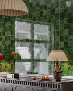
● Velvety Matte Coffee Tiles: As imported kitchen backsplash tiles or living room accents, their gentle, velvety texture creates a cocooning atmosphere, subtle yet deeply grounding
● Cappuccino Marble Veins: Brown marble-look tiles add sculptural quietness to floors and counters. Their veining gives the room soft rhythm, keeping large surfaces visually active. Ideal for foyers or high-end bathroom floor tiles that need quiet drama.
● Textured Taupes & Beiges: Stone-look porcelain tiles with gentle variation bring layered depth to large rooms, especially where the floor needs to visually anchor the furniture without overwhelming it.
● Caramel Gloss Accents: Glossy caramel finishes introduce subtle contrast, catching just enough attention to break monochrome schemes, introducing a refined highlight in spaces that need gentle contrast. Perfect for floor tiles for designer living rooms that aim for warmth and luminosity in equal measure. When matte meets gloss and texture dances with smoothness, interiors gain a quiet, layered elegance that lingers well beyond the moment.
3. The Lighter Side of Mocha: The Clay Continuum
“Each shade tells a story of earth refined, from the grounded depth of mocha to the tranquil whisper of raw sand.”
The Cotto Format Story is defined by its spectrum. Just as a perfect mocha finds harmony in froth and cream, our clay palette finds balance in soft, breathable tones, evolving from deep, grounded earth to lighter clays that open up a room with warmth and calm.
Moves Taupe (The Froth): “Clay lightened by air”
Soft and creamy, Moves Taupe behaves like the quiet lift of foam. Its ribbed texture catches light in gentle ripples. It brightens the palette without breaking its warmth, giving spaces a soft, uplifting clarity.

Season Canem (The Warm Milk): “Lines of light across fields of clay”
Sitting between beige and raw sand, Season Canem feels like the warming note that rounds off a brew. Its smooth, matte surface lays down a calm foundation, creating lines of light across fields of clay and giving rooms a grounded serenity.

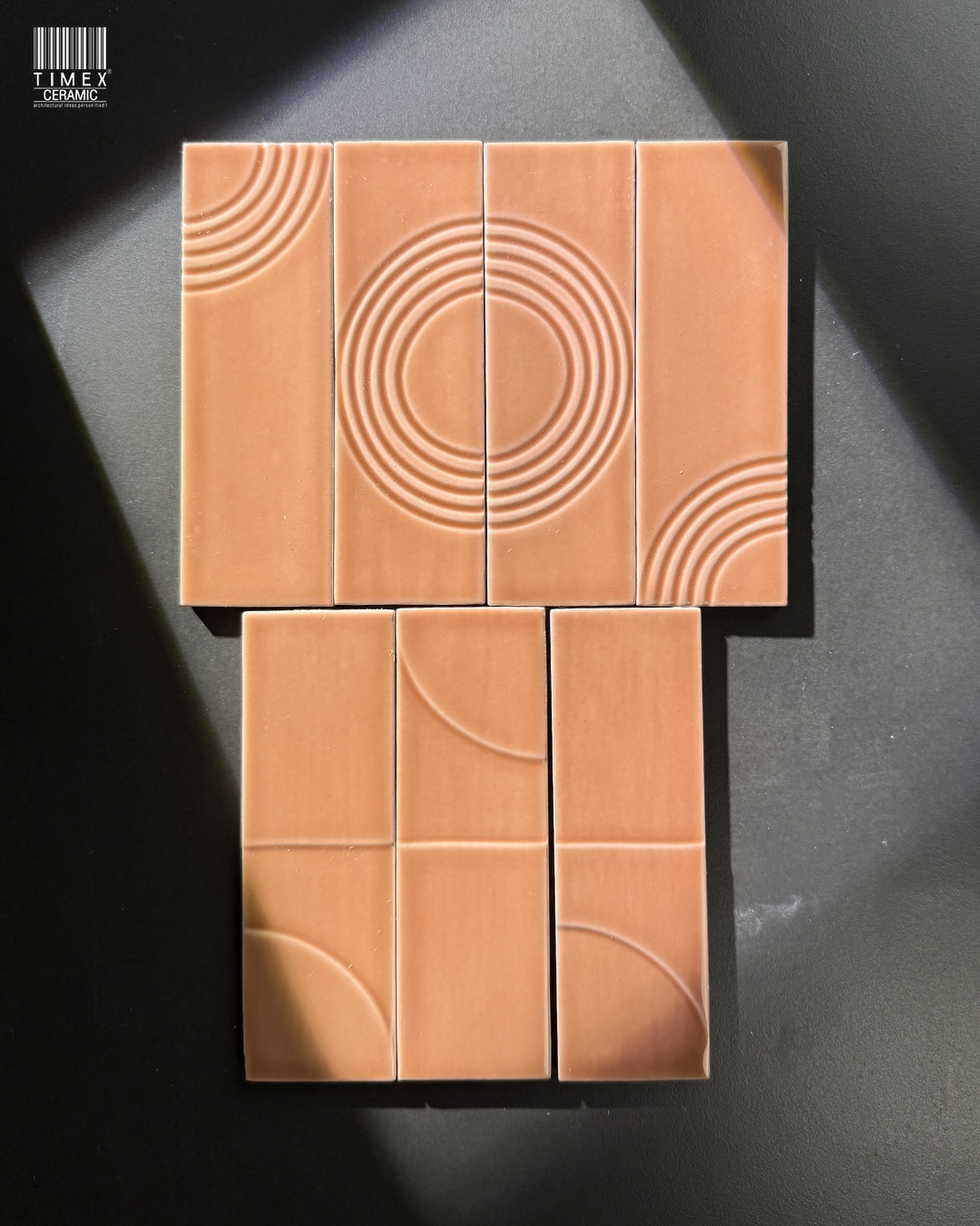
Arenta Coto (The Slow-Brew Depth): “Time-etched in Clay”
Arenta Coto carries the deep, earthy richness of slow-brewed mocha. With edges “time- etched in clay,” it brings structure, pattern, and a lived-in architectural weight. It’s the heritage heart of the palette.

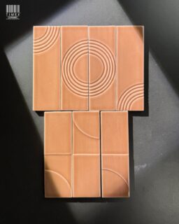
Spica Coto (The Roasted Earth): “Crafted by fire, shaped by rhythm”
Spica Coto echoes the roasted intensity of espresso beans. Its herringbone geometry adds movement underfoot, anchoring lighter tones with a rich, burnt-umber presence.

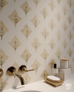
Aspdin Cotto Star Marina (The Toasted Note): “Where earth meets the sea”
With its rounded edges and sunlit warmth, Aspdin Cotto feels like a softened, toasted crema. Where earth meets the sea, it lends rooms a relaxed, Mediterranean glow, the golden-hour highlight of the mocha spectrum.

SW-22 (The Quiet Stir): “The rhythm of quiet earth”
SW-22 behaves like the slow swirl just before a mocha settles. Its elongated form carries “the rhythm of quiet earth,” softening walls with a steady, grounding movement. The decor variant adds a brushed highlight through its oval detail, like a gentle stir of milk blending into clay. Together, they bring a calm vertical cadence that completes the palette’s warm, brewed harmony.

4. Material Alchemy: Pairing Mocha with Interior Design Ideas
Mocha tones flourish when paired with complementary materials and finishes. Designers are embracing Pantone inspired interiors, integrating tone-on-tone schemes with rich textures to craft spaces that feel cohesive yet dynamic:
● Brass & Mocha: A Warm Conversation: Brushed brass details introduce a soft metallic contrast that sharpens the mocha tones and gives the room a more structured feel.
● Timber & Taupe: Organic Harmony: Wood cabinetry or beams blend naturally with taupe-based tiles, creating grounded, cohesive interiors that feel both warm and architecturally balanced.
● Seamless Grout Work: Opting for cream or beige grout softens edges and allows tile textures to shine, especially in zellige or subway formats.
● Layered Neutrals: Latte walls against dark roast floors create monochromatic depth, a quiet, architectural statement that works beautifully in both bathrooms and living spaces.
The result is spaces that breathe, balanced, warm, and visually seamless. In open living spaces, Timex Ceramic mocha tiles become a connector, softening strong lines and anchoring the room’s rhythm.
5. Why This Matters Now
You might ask: If 2026 is about ‘Cloud Dancer’ whites, why talk about Mocha now? he answer is balance. You cannot have the cloud without the earth. As global design shifts toward the airy, ethereal Cloud Dancer palette for 2026, the Cotto Mocha tones provide the necessary counterweight. They anchor the room. They prevent the “White” trend from feeling too sterile by adding a layer of tactile, roasted warmth underfoot.
6. Global Craft, Local Spaces: The Timex Edit
Timex Ceramic’s curated imported tile collection in India mirrors Pantone’s earthy turn with finesse. Our Spanish tiles showroom in Mumbai is a destination for architects, interior designers, and homeowners seeking globally inspired finishes tailored to local contexts. Highlights include:
● The 6621 Series: Classic octagonal geometry meets soft stone-like marbling. Its inset accents add a gentle architectural rhythm underfoot, giving hallways and living areas a composed, stately presence.

● Luxury Marble-Look Range: Deep brown and taupe veining brings quiet movement to floors, especially in foyers and bathrooms that need character without visual clutter.
● The Colonial Series: Boutique geometric tiles with a sculptural, artisanal presence. Their form adds subtle drama to walls or floors while staying gracefully within the warm palette.

● Zellige-Inspired Edibles Palette: Caramel and almond glossy tiles that bring a clean, handcrafted charm, ideal for expressive backsplashes or standout feature corners.
Each series is thoughtfully sourced to reflect global craftsmanship and architectural integrity, while aligning beautifully with India’s contemporary interiors.
7. The New Neutral: Bringing Pantone’s Mocha Home
“It’s the new language of clay, where colour and format merge into pure design emotion.”
As Pantone ushers in a year of warmth through Mocha Magic, the Cotto Format Story becomes its architectural foundation, where colour meets material and mood becomes space. Whether you call it a 2025 trend or simply the timeless pull of earth, these are surfaces with soul.
With the right selection of designer imported ceramic tiles, these edible-inspired hues can transform any space, from luxurious mocha-toned living rooms to warm bathroom walls and soulful kitchens. Discover the Mocha-inspired collection at Timex Ceramic. Or visit our Spanish tiles showroom in Mumbai.
Let our Cotto Format Story shape your next design narrative!